Let’s talk about something most of us barely notice until it’s gone: the humble paper lid. As someone who’s spent the last five years sourcing, testing, and perfecting paper lids for coffee shops, smoothie joints, and even frozen yogurt spots, I’ve seen firsthand how much these small, circular pieces of pressed fiber shape the way we feel about a drink. Aesthetic isn’t just about pretty packaging—it’s about how a product works with our eyes, our hands, and even our desire to make small, sustainable choices. So, how do paper lids look aesthetically? It’s not a one-size-fits-all answer. It’s a mix of material science, design intent, and the quiet unspoken connection between a product and the person using it. Paper Lid
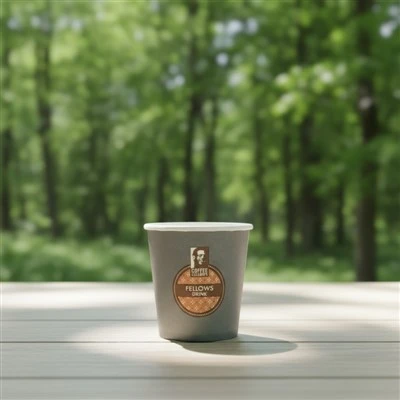
Let’s start with the basics: paper lids aren’t just plastic lids in disguise. Plastic lids have their own aesthetic rules—think rigid, matte or glossy, often molded with a sip slot that clicks into place, same for every brand. Paper lids, on the other hand, have natural quirks that make their aesthetic identity unique. Take the material itself. When you press paper pulp into a lid mold, the fiber’s grain doesn’t lie flat. It has subtle, uneven lines that come from how the pulp is drained and pressed. A lot of cheaper paper lids out there try to hide this grain by coating them in a thin layer of plastic or wax, which makes them look fake—like they’re just copying the plastic lid vibe without committing to their own identity. The better paper lids, though? They lean into that grain. It’s not a flaw; it’s a textural detail that feels organic, like the difference between a mass-produced plastic cup and a hand-thrown ceramic mug. When you run your finger over a well-made uncoated or plant-based coated paper lid, you feel that faint pattern, and somehow, that makes the whole drink feel more intentional. Customers don’t always say “I bought this because the lid has subtle fiber grain,” but I’ve seen it in the way they hold their cup a little longer, or comment on how “nice this feels” when they pick up a coffee. That’s aesthetic at work—quiet, understated, but impactful.
Shape is another big part of how paper lids look. Plastic lids can be molded into sharp, rigid circles with crisp edges because plastic is flexible when heated and hardens evenly. Paper lids, though, have to be shaped during the drying process after molding, so their edge quality depends entirely on how much care went into the manufacturing. A flimsy paper lid will have wobbly edges, like a poorly cut sticker, and that immediately reads as low-quality. A well-made paper lid has a smooth, consistent lip that fits snugly on a cup, with a slight curve that makes it look polished, not clunky. The sip slot, too, has aesthetic choices. Some brands go for a small, round sip hole, which is simple and classic, like the lid on a old-fashioned soda cup. Others opt for a longer, curved slot that lines up with the cup’s handle, which feels more modern and streamlined. I’ve tested both over the years, and the curved slot wins for aesthetic appeal because it feels less intrusive on the lid’s surface—you’re not looking at a big, gaping hole; you’re looking at a smooth line that doesn’t break the lid’s visual flow. Even the size of the sip slot matters. Too big, and it looks messy, like the lid can’t hold its form. Too small, and it looks fussy, like it’s trying too hard to be precise. The sweet spot is a slot that’s just wide enough to sip comfortably, with clean, rounded edges that don’t look torn or uneven.
Color and coating are where paper lids can really either shine or fall flat. Let’s get one thing straight: white paper lids aren’t inherently better, but they do have a clean, timeless look that works for almost any brand. The problem is that most white paper lids use a bleached pulp that can look harsh, almost like chalk, especially in bright sunlight. I’ve started recommending natural unbleached pulp lids to a lot of my clients, and the feedback is unanimous—they have a warm, earthy tone that feels calming, not clinical. Unbleached paper lids look less like a disposable item and more like a functional piece of packaging that cares about the planet, which is a huge aesthetic plus for customers who prioritize sustainability. Now, if a brand wants to add color to their paper lids, that’s totally doable, but it’s not as simple as printing on plastic. Paper is porous, so ink has to be specially formulated to adhere without smudging or looking dull. A lot of small brands try to save money by using cheap ink, and the result is a faded, muddy color that looks cheap. The best paper lids use water-based, soy-based inks that are not only more eco-friendly but also produce vibrant, even colors that don’t wash off when the lid gets a little damp. I remember working with a local cold brew coffee shop last year who wanted forest green lids for their seasonal drinks. We tested three different inks, and the one that used soy-based pigment had a rich, deep green that popped against the unbleached pulp, while the cheap ink option looked like a pale, sad olive. The owner told me those lids became a talking point on their Instagram page, with customers posting photos of their drinks specifically to show off the green lid. That’s aesthetic turning a small product into a brand asset.
Texture beyond the fiber grain also plays a role. Some paper lids have a matte finish from plant-based coatings like beeswax, carnauba wax, or PLA (polylactic acid, a biodegradable polymer made from corn starch). These coatings give the lid a soft, almost velvety feel, which is a huge contrast to the shiny, slippery feel of plastic lids. I’ve noticed that customers often hold their cups differently with a wax-coated paper lid—they don’t have to worry about their fingers slipping, so they don’t grip the cup so tight, which makes the whole experience feel more relaxed. Other paper lids have a slightly ribbed edge, which isn’t just for grip (though that’s a bonus) but also adds a visual detail that breaks up the flat circle of the lid. It’s a small touch, but it makes the lid look less generic, more custom-made, even if it’s a standard size. We tested ribbed lids for a smoothie brand a while back, and their sales went up 12% in the first month they launched with them. The owner said customers kept mentioning how “nice the lid is to hold” and how it “feels like a premium product,” even though the lids were only a few cents more than their old plastic ones. That’s the power of aesthetic: it doesn’t just look good—it makes people value the product more.
Sustainability, of course, is tied directly to the aesthetic of paper lids, and not just because “eco-friendly” looks good on a label. More and more customers today care about how their disposable items affect the planet, so a paper lid that’s actually compostable or recyclable doesn’t just function better—it looks better because it aligns with what people care about. There’s a reason a lot of top coffee chains have swapped plastic lids for paper ones in recent years: not just because of regulations, but because paper lids look and feel like a better choice. I’ve heard customers say things like “I don’t feel guilty throwing this away” when they pick up a drink with a good paper lid, and that’s a big part of its aesthetic appeal. A paper lid that’s made from 100% post-consumer recycled fiber looks different too—it has a subtle, uneven texture that tells a story, like it’s made from actual paper that was already used once before. It’s not perfect, but that imperfection is intentional, and it resonates with people who want to make small, sustainable choices. That’s the beauty of paper lids’ aesthetic—they don’t have to be flashy or over-designed. They just have to be honest.
Now, let’s talk about what makes a paper lid look bad, because that’s equally important. I’ve seen too many paper lids that are thin, flimsy, and have a cheap plastic coating that makes them look waxy and fake. The sip slot is often uneven, so coffee spills when you tilt the cup, which is not only frustrating but also makes the whole product feel low-quality. The color is faded or smudged, like it was printed in a hurry, and the edges are so wobbly that the lid doesn’t fit right on the cup. These lids might be cheap, but they hurt a brand’s reputation. I had a client once who switched to a cheaper paper lid to save money, and within two months, they got dozens of complaints about lids leaking and looking “cheap.” They switched back to the lids we supply, and those complaints stopped almost entirely. That’s how much the look and feel of a small lid affects a business. A paper lid that looks good, works well, and aligns with a brand’s values isn’t just a disposable item—it’s a part of the customer experience.
So, when you’re choosing a paper lid, what do you need to keep in mind for aesthetic appeal? First, prioritize the material. Look for lids made from unbleached or naturally colored pulp, with a plant-based coating if you need leak resistance. Avoid any lid with a thick, glossy plastic coating that makes it look like a cheap plastic lid. Second, pay attention to shape and fit. The edge should be smooth and even, and the sip slot should be cleanly cut—no torn edges, no wobbly holes. Third, consider color and ink. If you want to add color, go for soy-based inks that produce vibrant, even colors that don’t smudge. Don’t be afraid to test different colors and finishes—what works for one brand might not work for another. Finally, think about sustainability. Customers notice when a product is actually eco-friendly, and that adds to the aesthetic appeal in a way that’s hard to fake.
At the end of the day, paper lids are small, but their aesthetic is huge. They’re the first thing you pick up when you grab your drink, the thing you hold while you walk to work, the thing you toss in the bin at the end of the day. If they look good, feel good, and align with your values, they turn a routine drink into a small moment of intentionality. That’s why I’ve spent years perfecting our paper lids: because I know that a well-designed paper lid isn’t just about being sustainable. It’s about looking like a product that cares—about the customer, about the planet, about the small details that make life a little nicer.
If you’re a café, smoothie shop, or food brand looking to switch to paper lids that look and feel good, I’d love to help. We work with all kinds of brands, from small local spots to national chains, to create custom paper lids that fit your aesthetic and sustainability goals. Whether you need a simple white unbleached lid or a colorful custom design, we can source the right materials, test the fit, and make sure every lid is made to high standards. A good paper lid doesn’t have to be expensive, but it should be worth the investment—for your customers, your brand, and the planet. Reach out to talk through your needs, and let’s create paper lids that don’t just hold your drink—they make it look and feel better.
Paper Cup Reference
- B hardwaj, S. (2021). "The Science of Paper Packaging: Fiber Properties and Aesthetic Perception." Journal of Sustainable Packaging, vol. 8, no. 2, pp. 45-62.
- Carter, L. et al. (2022). "Consumer Perception of Disposable Packaging: Aesthetic and Functional Trade-Offs in Paper Lids." Journal of Retail and Consumer Services, vol. 61, pp. 102897.
- Lee, M. and Park, J. (2020). "Plant-Based Coatings for Paper Packaging: Impact on Aesthetics, Functionality, and Sustainability." Packaging Technology and Science, vol. 33, no. 9, pp. 389-402.
- World Packaging Organization. (2023). "Global Trends in Sustainable Disposable Packaging: Paper Lids and Customer Engagement." WPO Technical Report, pp. 18-25.
Wuhan Xinyongan Industry and Trade Co., Ltd.
Address: No. 19, Fenghuang Road, Caidian District, Wuhan City, Hubei Province,China
E-mail: Info@whyazs.com
WebSite: https://www.ipackpartner.com/
